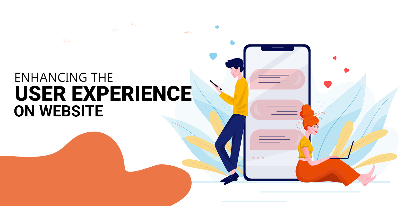
The website is the central focus of any digital marketing strategy, irrespective of the superficial or deep-rooted nature of the strategy. The website and its design matter a lot in defining the user experience. The growing ecosystem of web business has placed more responsibility on websites and their way of functioning. Basically, the website is a 24/7 active marketing platform that turns into a super-powerful asset and centric to the efforts you put in place to enhance your business efforts.
In the fast-changing and newly trending digital ecosystems websites, and their design gets outdated and obsolete. There is always the need for redesigning felt at this moment for investing time and energy. Here are a few methods to implement for improving user experience, when the websites are visited by the visitors:
#1 -Incorporate a Balanced White Space on Website Pages – White space on the website is good, but then too much of this space will put the visitors into confusion, or maybe the visitors would not be in the mood to browse through the interface. Appropriate use of white space on the website will give the end-user to put deliberate attention on the website. This white space is used in placing images or videos as and when required. White space surrounding the text as well as the titles will help people to get attracted by almost 20%. But you need to be sure that the white space on your website’s home page should be balanced and uniform. It should not be eating away the precious spacing by any means.
#2 – Increase the Page Speed – It is more than just a frustrating experience when you come to know web pages are taking more time to upload. In this type of situation, the visitors would leave the web page and move on to the next one. You have to understand there are different types of platforms available online where the visitors can visit anytime and the page speed is always high up. Slow page speed gives a disturbing experience to the web users and the level of frustration turns out to be quite high up. Website visitors do not have the time to wait for long. They are interested in knowing about a particular place or thing as quickly as possible, and this can only happen when anything written in the search field appears immediately. If you let your website visitors wait for an additional five seconds, then you are increasing the bounce rate by as much as 20%. There is service offered by many search engines, Google offers it for free, providing you the detailed information about your Mobile and Desktop. A good example of page speed is Barnes and Nobles- Irrespective of the device you use, their website loads really quick and more importantly, there are certain elements that show up instantly. Therefore, you know what is going to come in a short while.
#3 – Manipulating and Designing Striking Calls to Action – You need website visitors to take action, and this can only happen if you have amazing Calls to Action designed with the catchy words and effective message delivery. CTAs that are transparent and easily understood would help in driving traffic to your website. The site visitors can quickly navigate through the pages as they are clear about their priorities and everything else. It becomes necessary for everyone to manipulate and design the striking call to action. While designing an effective Call to Action, it is important that you keep the action words in place. You have to be particular on making the choice of right set of words, the psychological triggers as well as the emotive triggering system. You can make the words in the CTAs appear bold, or you can also trigger a time-sensitive action. The idea is that you should only have the right Call to Action, which is going to place you in a better position. You have to be sure about what really goes to whom. There are websites, whose entire page is oriented on the Calls to Action. This is just amazing and more realistic for the visitors visiting the website.
#4-Hyperlinking should be identifiable – Placing the links within the content gives out the message that you are asking the people to click on that link. You need to make the links attractive and catchy such that website visitors go there and click on those links. In order to draw the attention of any reader, you can have the underlined text and attractively colored text, which would help in drawing the attention. This is going to make the link more clickable. In short, if the hyperlinking strategy you are using is not identifiable, you may also lose the interest of the reader. And if the interest of a reader is lost, obviously, your business would have a great downfall.
#5- Attractively Designed Headings – The content and the style of headings should be such that your potential customers are getting naturally attracted to them. You may or may not include the keywords in your title, but the whole idea is that you have to be focused on what is really intended for your business. Search engines offer more value to the content that is written with a strong heading. However, make sure that the heading has clarity. It should drive your potential reader straight through the content body.
There are other points too that help your website to enhance the user experience and make them read what all is there on your website. However, make sure that your form and intent with respect to the website should be clear.


I hope that you won’t stop writing such interesting articles. I’m waiting for more of your content. I’m going to follow you!
Thank you, You can check we have already published some new articles on new topics
Exceptional post but I was wanting to know if you could write a litte more on this topic? I’d be very grateful if you could elaborate a little bit further. Kudos!
Yes you can write and send me